Facebook Call-to-Action Button Not Working? Common Fixes
Facebook CTA buttons usually fail for boring reasons: wrong objective, unsupported URL, missing permissions, slow landing page, or no tracking.
I would check those in this order:
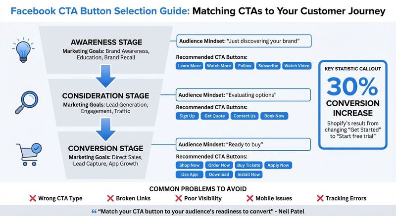
- Wrong CTA Type: Match the button, such as "Shop Now" or "Learn More", to your audience's stage in the buyer journey.
- Broken Links: Test all URLs to ensure they direct users to the correct, relevant destination.
- Poor Visibility: Place buttons prominently with contrasting colors to grab attention.
- Mobile Issues: Ensure buttons are easy to tap and lead to fast-loading, mobile-friendly pages.
- Tracking Errors: Set up Meta Pixel and UTM parameters to measure performance accurately.
For cross-platform campaigns, also check the destination page itself. A working Facebook CTA can still underperform if the link preview is broken on LinkedIn, X, Threads, or Bluesky, or if your UTM naming splits one campaign into several rows.
Don't Use This Facebook Ads CTA!
## Facebook Call-to-Action Button Not Working? Common FixesFacebook's call-to-action buttons look simple, but Meta's ad objective, Page permissions, URL rules, and tracking setup all affect whether the button works. Start with the mechanical checks before rewriting copy.
Wrong CTA Button Type
Choosing the wrong type of CTA button can create a disconnect with your audience. For example, using a "Shop Now" button for someone who's just discovering your brand can feel pushy, while showing a "Learn More" button to someone ready to buy might leave money on the table.
To complicate things, Meta limits which buttons are available based on your chosen ad objective. If you pick the wrong objective, you might not even see the button that fits your campaign's goals. For instance, the "Donate Now" button only becomes available under specific objectives, like Leads or Awareness, and requires additional setup for payment enrollment [4].
"The key to choosing a CTA is understanding your target audience's position in the buyer's journey. Match your CTA button to their readiness to convert." - Neil Patel, Digital Marketing Expert [5]
A small wording change can matter when it removes doubt. "Start free trial" is more specific than "Get Started" because it tells the user what happens next. That is the kind of CTA change worth testing.
| Marketing Goal | Recommended CTA Button | Funnel Stage |
|---|---|---|
| Brand Awareness | Learn More, Watch More, Follow | Top of Funnel (Awareness) |
| Lead Generation | Sign Up, Get Quote, Contact Us | Middle of Funnel (Consideration) |
| Direct Sales | Shop Now, Order Now, Buy Tickets | Bottom of Funnel (Conversion) |
| App Growth | Use App, Download, Install Now | Conversion/Action |
Broken or Non-Working Links
Broken links or URLs that lead to the wrong destination can destroy user trust and derail your campaign. Facebook only supports specific types of links, such as external URLs, Facebook events, Pages, or Groups. If your link doesn't fit one of these categories, the button simply won't work [4].
To avoid high bounce rates, make sure your CTA leads users to a specific and relevant page. Accurate linking keeps users engaged and reduces drop-offs.
Poor Button Placement or Visibility
Where you place your CTA button matters - a lot. Buttons buried in cluttered layouts or positioned below the fold often go unnoticed. If your button isn't the most visually dominant element on the page, clicks will suffer.
Contrast is another key factor. Buttons that blend into their background can easily be overlooked. In fact, 85% of consumers say color influences their purchasing decisions [8]. High-contrast buttons that stand out are much more likely to grab attention.
To boost performance, ensure your CTA button is prominently placed and visually distinct from surrounding elements.
Mobile Optimization Problems
With most Facebook users browsing on mobile devices, failing to optimize CTA buttons for smartphones can tank your conversions. Small buttons, distorted layouts, or slow-loading pages are common culprits [7][8].
Did you know? A 1-second delay in page load time can result in a 7% drop in conversions [7]. Pages that take over 5 seconds to load see even higher bounce rates [7]. Additionally, some ad formats don't support mobile-specific placements, like Reels or Stories, which can lead to "No valid formats" errors [6].
To avoid these issues, keep your CTA text short - ideally 5 to 6 words - so it displays properly on smaller screens. Also, ensure your landing pages are fast and mobile-friendly.
Tracking and Analytics Setup Issues
You can't improve what you can't measure. If you skip setting up the Meta Pixel or UTM parameters, you'll miss out on critical insights for tracking conversions and optimizing campaigns [4].
A common error is the "no promotion object found" issue, which happens when the Meta Pixel isn't installed or selected during ad set creation [4]. Missing roles or permissions can also block proper tracking setup [4]. Without these tools, you're essentially flying blind.
| Common Error Code | Likely Cause | Recommended Fix |
|---|---|---|
| 1815563 / 2446433 | Unsupported URL or lack of Page permissions | Check Page roles; ensure URL is an external site or valid Facebook link [4] |
| 1885029 | Pages don't match between Ad Set and Ad | Ensure the Page selected in "Conversion" matches the "Identity" [4] |
| 1815430 / 1487790 | No promotion object found | Install or select the Meta Pixel during ad set creation [4] |
| 1815952 | Unsupported ad format for objective | Change the objective or use a compatible post type (e.g., single image) [4] |
How to Fix Facebook CTA Button Problems
Here are practical ways to tackle issues with Facebook CTA buttons and improve their performance.
Choose the Right CTA Button
Your CTA button should align with where your audience is in the customer journey. For example:
- Awareness-stage users prefer low-pressure options like "Learn More" or "Watch Video."
- Consideration-stage users respond well to buttons like "Contact Us" or "Get Quote."
- Conversion-stage users need direct action buttons, such as "Shop Now" or "Order Now" [9][1].
Meta's streamlined ad objectives - Awareness, Traffic, Engagement, Leads, App Promotion, and Sales - determine which buttons are available for your campaign [1].
Jay Baer's useful framing is simple: judge the CTA by audience response instead of visual polish [5].
Using action-oriented verbs like "Shop," "Call," or "Email" can make your CTAs clearer [2]. Urgency can help when it is true. If the offer does not expire, do not fake it.
Small changes are worth testing, but test one variable at a time. Otherwise you will not know whether the button text, landing page, creative, or audience caused the result.
| Funnel Stage | Business Goal | Recommended CTA Buttons |
|---|---|---|
| Awareness | Brand recall, education | Learn More, Watch Video, Follow, Subscribe |
| Consideration | Engagement, traffic | Book Now, Contact Us, Get Quote, Sign Up |
| Conversion | Sales, lead capture | Shop Now, Order Now, Buy Tickets, Apply Now |
Test and Update Links Regularly
Broken links can hurt trust and kill conversions. Before launching a campaign, use Facebook's "Test Button" feature to ensure your CTA directs users to the correct destination [4].
Facebook supports specific link types, including external websites, Facebook events, Pages, and Groups [4]. Make sure your URL meets these requirements.
Also, check your permissions. You need to be a Page admin or editor to edit CTA buttons on existing posts [4]. Without the correct access, you can't fix issues even if you spot them.
Regularly test your links - weekly or monthly. Websites change over time, and broken links can frustrate users and waste ad spend.
Improve Button Placement and Design
Place your CTA button where it's immediately visible - usually near the top or center of your ad creative, close to the headline [10][3]. Buttons hidden below the fold or buried in cluttered layouts are often missed.
Make your button visually stand out. Use contrasting colors to draw attention, and ensure it's the most dominant element on the page. A well-designed button can boost click-through rates by up to 121% [5].
As Iliya Avramov, CEO of AdwayCreative, puts it, the CTA and landing page need to work together because both affect conversion [5].
Make Buttons Mobile-Friendly
Design buttons that are easy to tap on mobile devices. Ensure they're large enough, with proper spacing between elements, to avoid accidental clicks [3]. Use Scalable Vector Graphics (SVG) for icons and images so they look sharp on high-resolution screens [3].
Adopt a fluid grid system for your landing pages so buttons and content adjust to different screen sizes [3]. Keep your CTA text short - ideally 5 to 6 words - so it displays well on smaller screens.
Always test your buttons on actual mobile devices before launching. A design that looks great on desktop might not work as well on a smartphone. Check that buttons are easy to tap, load quickly, and lead to mobile-optimized landing pages.
Sarah Johnson, Head of Marketing at TechStart Inc., shared: "We saw a 27% increase in conversions when we added urgency to our Facebook ad CTAs. It's a simple change that can make a big difference" [5]. Phrases like "Limited Time Offer" are especially effective for mobile users making quick decisions [2][5].
Once your buttons are optimized for mobile, track their performance and refine your strategy as needed.
Set Up Tracking and Analytics
To measure the effectiveness of your CTAs, install the Meta Pixel on your website [4]. Make sure to select the Pixel during ad set creation to avoid errors like "no promotion object found" [4].
Use UTM parameters in your destination URLs to track traffic sources. Stick to consistent naming conventions so you can easily compare campaign performance.
Double-check your Page roles and permissions before setting up tracking. Missing roles can block proper configuration [4]. Also, ensure the Page selected under "Conversion" matches the "Identity" to avoid tracking issues [4].
Run A/B tests to fine-tune your CTAs. Experiment with single variables like button color, size, placement, or text (e.g., "Sign Up" vs. "Learn More") [1][3]. Test one element at a time to understand what drives improvements. Track results for at least two weeks to account for daily performance variations.
How TheBlue.social Helps With Cross-Platform Campaigns
TheBlue.social does not manage Facebook ads or edit Facebook CTA buttons. I would use it around the campaign: preview the destination link, keep cross-platform posts aligned, add accessible image text, and track what happens on Bluesky.
Keep the campaign consistent across platforms
Facebook may be the paid CTA, but the same campaign often has supporting posts on other networks. TheBlue.social's scheduler helps you plan those posts across X, Threads, Instagram, Pinterest, LinkedIn, Bluesky, and Mastodon.
That matters when the offer, launch time, and UTM campaign name need to stay consistent.
Use Free Tools to Improve Campaign Performance
Before publishing, run the destination URL through the Open Graph Preview Tool. It shows how the link preview appears on social platforms, so you can catch missing titles, weak descriptions, broken images, or a preview that does not match the CTA.
The Generate Alt Text for Images tool helps create image descriptions for campaign assets. If an image includes text, Extract Text from Images can pull it out so you can compare the visual message against the CTA.
Track Engagement and Performance
For Bluesky campaign posts, Bluesky analytics helps you see which supporting posts get replies, reposts, likes, and follower growth. Pair that with UTMs and your web analytics for click and conversion tracking.
Conclusion
Facebook CTA fixes are mostly checklist work. Pick the right objective, use a supported URL, confirm Page permissions, test the destination on mobile, and make sure the Pixel and UTMs are in place.
Then check the campaign around the CTA. Use TheBlue.social's Open Graph Preview Tool before sharing the landing page elsewhere, schedule supporting posts across the platforms TheBlue.social supports, and use Bluesky analytics to see which Bluesky posts help the campaign.
Jay Baer's point is worth keeping in mind: the CTA that works is the one your audience responds to [5].
Keep testing one variable at a time. Button text, destination page, creative, and timing can all change results.
FAQs
What's the best way to choose a Facebook call-to-action (CTA) button for each stage of the buyer's journey?
Choosing the right Facebook CTA button for each phase of the buyer's journey is key to guiding prospects smoothly from discovering your brand to taking action. In the awareness stage, stick to low-pressure options like "Learn More" or "Watch Video". These buttons are perfect for sparking curiosity and giving users a chance to get to know your brand without feeling overwhelmed.
When prospects move into the consideration stage, it's time to encourage interaction. Use CTAs like "Sign Up" or "Contact Us" to invite users to engage further or share their details. These options build a bridge between interest and decision-making.
Finally, for the conversion stage, go for action-oriented buttons such as "Shop Now" or "Download". These CTAs are designed to drive purchases or encourage users to complete a specific action, bringing them closer to becoming customers.
Always ensure your CTA matches your campaign objective in Meta Ads Manager - whether it's Traffic for awareness or Conversions for purchases. Don't forget to test different CTAs and monitor performance metrics like click-through rates and conversions. This helps fine-tune your strategy for each step of the buyer's journey.
What mistakes should I avoid when setting up Facebook Call-to-Action buttons?
When setting up Facebook Call-to-Action (CTA) buttons, there are several mistakes you'll want to steer clear of to ensure everything runs smoothly.
First, double-check your Page permissions. Only admins or editors can add or edit CTA buttons, and you'll need ad-creation permissions to make changes. Without these roles, the button will stay locked, leaving you unable to make adjustments. Another key detail: a single post can only be used for one ad. Once published, it cannot be edited or reused to change the CTA. If you need a different CTA, you'll have to create a new post or ad instead of modifying the old one.
Another common problem is using unsupported URLs with the button. Make sure the link you're attaching is valid - acceptable options include website URLs, Facebook event links, or Page links. Unsupported links can cause errors and prevent the button from saving properly.
On the strategic side, avoid vague button text like "Click Here." It doesn't give users a clear idea of what action to take. Similarly, using too many CTAs on the same page or mismatched buttons - like a "Buy Now" button for a campaign focused on brand awareness - can confuse users and hurt your results. And don't overlook the power of A/B testing. Testing different button texts, placements, or link destinations can make a big difference in improving your click-through rates.
By addressing these technical and strategic missteps, you can set up Facebook CTA buttons that are clear, effective, and more likely to drive the results you're aiming for.
How can I make Facebook call-to-action buttons more effective for mobile users?
To make Facebook call-to-action buttons more user-friendly for mobile users, focus on ensuring they're easy to see, tap, and interact with on smaller screens. Here's how:
- Use a clear, readable font size so users don't need to zoom in. Skip overly decorative or tiny text.
- Make the button large enough - at least 44×44 pixels - to allow comfortable tapping without accidental clicks.
- Position the button thoughtfully, placing it where thumbs naturally reach, like the lower part of the screen. Leave enough white space around it to draw attention.
- Pick high-contrast colors to help the button stand out against the background. Pair this with concise, action-driven text like "Sign Up" or "Learn More."
- Test on multiple devices to ensure the button looks good and functions properly across various screen sizes and orientations.
These tweaks can enhance the user experience, encourage more clicks, and ultimately lead to higher conversions on mobile.
Last updated: June 13, 2026