Best Practices for Screen Reader-Friendly Social Media Posts
Creating social media posts that work well with screen readers is about making your content accessible to everyone, including individuals who rely on assistive technologies. Here’s what you need to know:
- Use clear, simple text: Avoid jargon, spell out acronyms, and keep sentences short.
- Add alt text for images: Describe key details in less than 125 characters without starting with "image of."
- Format hashtags with CamelCase: Use #ScreenReaderFriendly instead of #screenreaderfriendly.
- Include captions and transcripts for videos: Ensure all spoken content and on-screen text are accessible.
- Limit emojis and special characters: Place emojis at the end of your post to avoid disrupting screen readers.
- Ensure color contrast: Text should have a contrast ratio of at least 4.5:1 for readability.
Accessible content isn’t just good for compliance with laws like WCAG 2.1, ADA, and Section 508 - it also improves user experience for everyone, including those in noisy environments or using voice commands. Simple adjustments like these can significantly enhance how your content is received and understood.
How to Create Accessible Social Media Content
## Core Principles for Screen Reader-Friendly Social Media PostsMaking social media posts accessible to screen readers requires careful attention to structure and detail. From text to visuals, every element should be designed to ensure everyone can engage with your content.
Text Clarity and Formatting
The foundation of accessible content is plain, easy-to-read language. Screen readers perform best with simple, conversational text. If you’re using acronyms or specialized terms, always spell them out the first time they appear to avoid confusion.
Stick to short sentences and focus on one idea per paragraph. This not only benefits screen reader users but also makes your posts easier for everyone to skim and understand.
When it comes to hashtags, formatting matters. Use CamelCase (e.g., #ScreenReaderFriendly) so screen readers can correctly identify each word.
Avoid using decorative fonts, excessive special characters, or text art. These can confuse screen readers, leading to mispronunciations or skipped content. Standard fonts and minimal special characters ensure your message is clear and accessible.
Next, let’s tackle how to make visuals just as inclusive.
Media Accessibility
Clear text is just one piece of the puzzle - your images and videos need to be accessible too. For every image, include concise and descriptive alternative text (alt text) that conveys the essential visual information. Keep alt text under 125 characters and focus on the most important elements.
For instance, instead of saying "image of a person", opt for something specific like "A businesswoman using ASL during a Zoom meeting." Avoid starting with phrases like "image of" or "picture of", as they add unnecessary words.
For videos, include captions for all spoken content and provide transcripts for audio. If your video includes on-screen text that isn’t spoken, make sure to describe it in your post or captions.
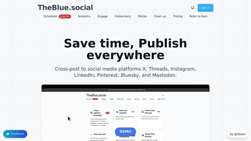
Tools like TheBlue.social’s free alt text generator can help simplify the process of creating descriptive image text, making accessibility easier to achieve.
Emoji and Link Usage
Use emojis sparingly - they can disrupt the flow for screen readers. Placing them at the end of your post rather than scattering them throughout ensures a smoother reading experience.
When adding links, make them descriptive. Instead of generic phrases like "click here" or "read more", use specific ones such as "Explore our accessibility guide" or "Check out the 2024 social media report." This gives users a clear idea of what to expect.
Also, avoid posting long URLs directly in your content. Screen readers will read them aloud, character by character, which can be tedious. Most platforms automatically shorten links or let you embed them in descriptive text.
Color and Visual Contrast
Good color contrast is essential for readability, particularly for users with low vision or color blindness. Aim for a contrast ratio of at least 4.5:1 between text and background to ensure clarity in different viewing conditions.
Never rely solely on color to convey information. If you’re using colors in graphics or charts, include text labels or patterns to communicate your message. For example, if a chart uses colors to differentiate data, ensure each section has clear labels or unique patterns as additional indicators.
| Accessible Practice | Inaccessible Practice |
|---|---|
| #ScreenReaderFriendly | #screenreaderfriendly |
| Alt text: "Woman signing in ASL" | No alt text provided |
| "Explore our accessibility guide" | "Click here" |
| High contrast text (4.5:1 ratio) | Light gray text on white background |
| 😊 placed at end of post | 😊😊😊 scattered throughout text |
Step-by-Step Guide to Creating Accessible Social Media Posts
Making social media content accessible doesn’t have to be complicated. By following a structured process, you can ensure your posts are inclusive and reach everyone - including the nearly one in five Americans living with a disability [2].
Drafting the Post
Start by putting the most important details at the beginning. This approach helps screen readers deliver information in a logical order. Keep your language plain and conversational, and aim for short, clear sentences.
When using acronyms, spell them out the first time (e.g., "Artificial Intelligence (AI)"). If you need to repeat them often, consider adding periods between letters (like A.I.) so screen readers pronounce each letter distinctly.
Avoid technical jargon unless it’s absolutely necessary. If you must include specialized terms, provide a quick explanation. The goal is simple: make your writing clear and easy to understand for everyone.
Once your text is ready, focus on making your media accessible.
Adding Media Accessibility Features
For images, write concise and descriptive alt text. Highlight the key details that help convey your message, but skip phrases like "image of" or "picture of" - they’re unnecessary.
For videos, add captions for all spoken content. If your video includes on-screen text that isn’t spoken, describe that information in your post text so screen readers can pick it up. Transcripts are especially helpful for longer videos, providing an extra layer of accessibility.
Tools like TheBlue.social’s Generate Alt Text for Images can simplify this process. This platform has already helped users create over 20,374 alt texts [1], making it a valuable resource for content creators managing multiple posts. For high-volume tasks, their Bulk Image Alt Text Generation tool is a great option.
Optimizing for Screen Reader Compatibility
When using hashtags, format them in CamelCase (e.g., #ScreenReaderFriendly). This ensures screen readers pronounce each word separately, rather than as a jumbled string.
Place emojis, mentions, and tags at the end of your post. Screen readers announce each emoji’s description, which can disrupt the flow of your message if they’re scattered throughout the text. Also, stick to standard fonts - decorative or special characters can confuse screen readers.
Once your post is formatted, it’s time to test it for accessibility.
Testing and Refining Posts
Before hitting publish, test your post using screen reader software like VoiceOver (available on Mac and iOS), NVDA (free for Windows), or JAWS. Listening to your post being read aloud can reveal issues you might not notice when reading silently, such as awkward phrasing or mispronunciations.
Use online tools to check color contrast, ensuring your text meets the minimum 4.5:1 ratio against its background. This makes your content easier to read for users with low vision or color blindness.
Finally, consider reaching out to individuals with disabilities in your community for feedback. Their firsthand experience can offer insights that technical testing might miss, helping you fine-tune your approach over time.
| Testing Method | What It Checks | When to Use |
|---|---|---|
| Screen reader software | Audio flow and pronunciation | Every post before publishing |
| Color contrast checker | Text readability ratios | Posts with custom graphics or colors |
| Manual review | Overall clarity and structure | Complex posts with multiple elements |
Tools for Accessibility
Making your content accessible doesn’t have to be complicated. With the right tools, you can simplify the process and ensure your posts are inclusive for everyone. Whether you’re managing a single account or juggling multiple platforms, these resources can save you time while improving accessibility.
TheBlue.social Accessibility Tools
TheBlue.social provides a range of free tools designed to help content creators address common accessibility challenges. These tools are easy to use and can make your posts more inclusive without adding extra work to your schedule.
- Generate Alt Text for Images: This tool automatically creates descriptive alt text for your images, taking the guesswork out of writing effective descriptions.
- Extract Text from Images (OCR): Perfect for infographics, screenshots, or memes, this tool extracts embedded text so it can be included in your post or alt text. This ensures screen readers capture all the important details.
- Open Graph OG Preview Tool: With this tool, you can preview how shared links will appear on platforms like Facebook, X (Twitter), LinkedIn, and Discord. It ensures metadata, titles, and descriptions are consistent and accessible for screen readers.
- Bulk Image Alt Text Generation: For those managing a high volume of content, this feature streamlines alt text creation. Available through the $20/month Pro plan, it’s ideal for frequent posters.
Manual Testing Methods
While automated tools handle the heavy lifting, manual testing is essential to ensure your content is genuinely usable. Screen reader software is particularly helpful for assessing how your posts will sound to users.
- VoiceOver: Built into Mac and iOS devices, this tool can be enabled in System Preferences to review your draft posts.
- NVDA: A free screen reader for Windows, offering accurate and reliable testing.
- JAWS: A popular choice among accessibility professionals, though it requires a paid license.
When testing, pay attention to how hashtags and emojis are read aloud. Using CamelCase (e.g., #ScreenReaderFriendly) improves clarity, and reviewing emoji descriptions ensures they don’t disrupt your message.
Additionally, color contrast checkers are invaluable for visual content. A minimum contrast ratio of 4.5:1 between text and background colors is recommended to make content readable for users with low vision or color blindness. Browser extensions and online tools can quickly evaluate your graphics and suggest adjustments.
| Tool Type | Purpose | Best For |
|---|---|---|
| TheBlue.social Generate Alt Text | Automated alt text creation | All image types |
| TheBlue.social OCR Tool | Extract text from images | Infographics, screenshots, text-heavy visuals |
| Screen reader software | Real-world accessibility testing | Final review before publishing |
| Color contrast checkers | Visual accessibility compliance | Custom graphics and branded content |
Common Accessibility Mistakes and How to Fix Them
Addressing common accessibility mistakes is a simple yet impactful way to make your content clearer and more inclusive. These errors often occur unintentionally but can exclude nearly one in five Americans who have a disability[2]. For users relying on screen readers or other assistive tools, such mistakes create unnecessary barriers.
One frequent issue is missing or inadequate alt text on images. Without descriptive text, screen readers skip over images entirely, leaving users without vital context. Think about a product launch photo, a key infographic, or even a meme - without alt text, they lose their meaning. The fix? Add concise, descriptive alt text that captures the image's essential details.
Another common problem is video content without captions or transcripts, which excludes users who are deaf or hard of hearing. The solution is straightforward: include accurate captions during the upload process and, when possible, provide transcripts[4].
Hashtag formatting is another subtle yet important consideration. Hashtags written entirely in lowercase (e.g., #accessibilityforall) or all caps (e.g., #ACCESSIBILITYFORALL) can confuse screen readers. Instead, use CamelCase formatting - for example, #AccessibilityForAll - to ensure clarity.
Overusing emojis can also disrupt accessibility. When screen readers encounter emojis, they read out each one’s description. A string of emojis 🎉🎉🎉 can interrupt the flow of your message. To keep things clear, limit emojis to one or two and place them at the end of your content[3].
Text formatting choices matter too. All-caps text, decorative fonts, or ASCII art can confuse screen readers, which often interpret them letter by letter. Stick to standard capitalization and plain fonts to ensure your message comes across clearly[3].
Visual design also plays a critical role. Color contrast issues can make text difficult to read for users with low vision, even when they use screen readers alongside visual cues. For instance, if text contrast falls below the recommended 4.5:1 ratio, it can become nearly unreadable. This is a common issue in stylized graphics or branded quote cards where design often overshadows accessibility[4].
Here’s a quick breakdown of common mistakes and their fixes:
| Mistake | Impact on Accessibility | Solution |
|---|---|---|
| No alt text on images | Screen readers skip images entirely | Add descriptive alt text (e.g., "Woman presenting quarterly sales data on whiteboard") |
| Uncaptioned videos | Excludes deaf and hard-of-hearing users | Upload accurate captions and provide transcripts |
| Lowercase hashtags (#socialmedia) | Screen readers may mispronounce or skip hashtags | Use CamelCase formatting (e.g., #SocialMedia) |
| Emoji overload 🎉🎉🎉🎉 | Disrupts message flow when read aloud | Use 1–2 emojis at the end of posts |
| ALL CAPS TEXT | May be read as individual letters | Use standard capitalization |
| Light gray text on white background | Unreadable for low vision users | Ensure a contrast ratio of at least 4.5:1 |
Another tip: use URL shorteners and spell out acronyms like SEO or CTA. Screen readers read web addresses character by character, turning long URLs into a tedious experience[4].
To tackle alt text issues, tools like TheBlue.social's Generate Alt Text for Images can automatically create descriptive text for your visuals. Similarly, their Extract Text from Images (OCR) tool makes text embedded in graphics accessible to screen readers.
The best way to avoid these mistakes? Make accessibility checks a routine part of your content creation process - not an afterthought. Small adjustments in formatting, image descriptions, and post structure can make a world of difference for users relying on assistive technologies.
Conclusion
Making your posts screen reader-friendly is a step toward creating a more inclusive digital space. With 26% of U.S. adults living with disabilities [2], accessible content ensures your message reaches people who might otherwise be left out.
There are straightforward ways to make your posts more accessible. Start with the basics: use descriptive alt text for images, write hashtags in CamelCase (e.g., #SocialMedia), add captions to videos, stick to clear and simple language, limit emoji use, and ensure proper color contrast. These small adjustments can make a big difference.
Accessibility doesn't just benefit people with disabilities - it improves clarity and usability for everyone, including those with cognitive differences or non-native speakers. Writing with accessibility in mind naturally leads to content that's more engaging and easier to understand.
Organizations that prioritize accessibility often see increased engagement [2]. For example, TheBlue.social has generated over 20,374 alt texts with its Generate Alt Text for Images tool [1], showing how automation can simplify the process of creating accessible content.
FAQs
Why should I use CamelCase for hashtags to make social media posts accessible to screen readers?
Using CamelCase - capitalizing the first letter of each word in a hashtag, like #ScreenReaderFriendly - helps screen readers interpret and pronounce the words correctly. Without it, screen readers might read the hashtag as one long, jumbled word, which can make it hard to understand for users who depend on them.
But it’s not just about screen readers. CamelCase also makes hashtags easier to read for everyone, ensuring your content is clearer and more inclusive for a broader audience.
How can I make my videos accessible for users who rely on screen readers or are hard of hearing?
To make your videos accessible to everyone, include descriptive captions for spoken words and essential sounds. These captions are crucial for viewers who are hard of hearing. Additionally, incorporate audio descriptions to narrate visual elements that aren't covered in the audio. This helps users who rely on screen readers by painting a clearer picture of the visual content.
Another important step is offering a text transcript of the video. This provides an alternative way for users to access the information, whether they prefer reading or need the assistance of a screen reader. By following these practices, you ensure your videos are inclusive and usable by a broader audience.
How can I easily create alt text for images in my social media posts?
Creating alt text for your images can be straightforward. With TheBlue.social, you can use their free tool to automatically generate alt text for your images. This helps make your social media posts more inclusive and accessible for screen readers. It's an easy way to save time while ensuring your content reaches everyone.
Last updated: October 29, 2025