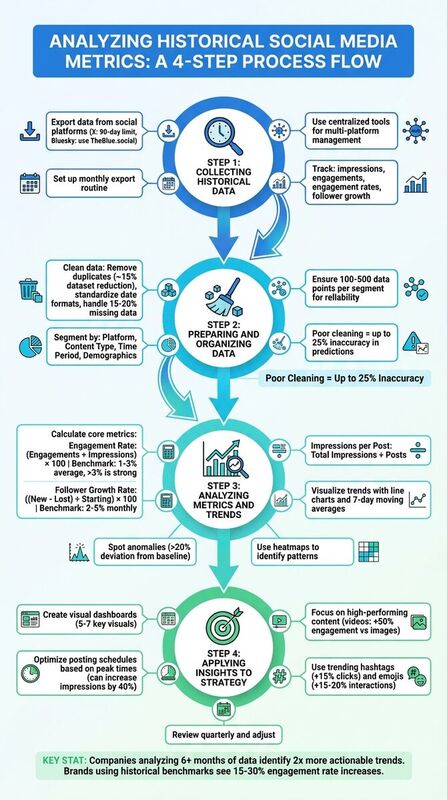
How to analyze historical social media metrics
Historical social metrics are useful only when they change what you publish next.
Do not start with a giant dashboard. Start with these questions.
- Which posts brought real replies?
- Which topics grew followers?
- Which links brought traffic or signups?
- Which posting times repeatedly worked?
- Which platform deserved more effort?
For X, Instagram, LinkedIn, Pinterest, and other mature networks, export from the native dashboards or your reporting stack. For Bluesky, use a Bluesky-specific layer such as TheBlue.social Analytics, because Bluesky does not give you the same native analytics export surface that older platforms do.
Then clean the data, compare like with like, and turn the result into one publishing decision.
A social media manager's view of Metricool analytics
## Step 1 - collect historical dataEvery useful analysis starts with the right source. Each platform gives you a different amount of history, a different metric vocabulary, and a different export format.
Exporting Data from Social Platforms
For platforms with native analytics, export the raw CSVs before the retention window moves on. Save the platform name, date range, and export date in the file name. Boring filenames beat clever ones here.
Use a folder structure like this:
social-metrics/
  2026-06/
    x-posts-2026-06-01-to-2026-06-15.csv
    instagram-posts-2026-06-01-to-2026-06-15.csv
    linkedin-posts-2026-06-01-to-2026-06-15.csv
    bluesky-notes.md
For Bluesky, track likes, replies, reposts, quotes, follower growth, and post timing. TheBlue.social is useful here because it is built around Bluesky analytics, weekly growth reports, and the "When Posts Get Liked" heatmap.
Using TheBlue.social for Data Collection
Use TheBlue.social for the Bluesky part of the job, not as a magic warehouse for every social platform.
The useful pieces are specific:
- Bluesky Analytics for post engagement and follower growth.
- Weekly growth reports for a connected Bluesky account.
- The "When Posts Get Liked" heatmap for timing patterns.
- Bluesky network stats for network-level context.
- Cross-posting when you want to test the same idea across X, Threads, Instagram, LinkedIn, Pinterest, Bluesky, or Mastodon.
For full cross-platform attribution, combine that with native exports, GA4, and a spreadsheet or BI dashboard. That boundary matters. Bluesky analytics and cross-posting are not the same thing as a universal analytics database.
Step 2: prepare and organize the data
After gathering metrics, clean the raw data before drawing conclusions. Social exports usually contain duplicate rows, inconsistent date formats, missing values, deleted posts, and platform-specific metric names.
Data Cleaning Best Practices
Eliminate duplicate records. Duplicates happen when you export overlapping date ranges or repost the same link across platforms. Use a post URL, post ID, and timestamp as your dedupe key.
Standardize dates and time zones. Convert every export into one time zone before comparing posting times. A 9 a.m. Singapore post and a 9 a.m. New York post are not the same audience moment.
Handle missing data honestly. Do not quietly fill missing impressions, reach, or shares with a guessed number. Mark the value as missing and exclude it from calculations where it would distort the result.
Standardize units and inspect outliers. Convert shorthand such as 1.5K or 1.5M into numbers. Keep viral posts in a separate view so they do not make normal posts look broken.
Once your data is clean, the next step is to structure it into segments that allow for actionable analysis.
Segmenting Data for Analysis
With a polished dataset, segmenting your data is essential for uncovering trends across platforms and content types. Breaking data into meaningful categories helps you identify patterns that might otherwise go unnoticed. Key segments to focus on include platform, content type, time period, and audience demographics.
Platform segmentation helps identify which networks perform best for your goal. Add a platform column and compare within each platform first. A strong Bluesky reply thread and a strong LinkedIn carousel may not look alike in the raw numbers.
Content type segmentation shows which formats work. Tag each post as text, image, video, link, poll, thread, or carousel. Keep the categories plain enough that everyone on the team uses them the same way.
Time period segmentation reveals weekly, seasonal, or launch-related changes. On Bluesky, compare your own heatmap and post history before assuming generic "best time to post" advice applies.
Avoid over-segmenting. If you split by platform, format, day, hour, topic, and campaign, you may end up with three posts in a bucket and a false lesson. Start broad. Drill down only when the sample is large enough to trust.
| Segmentation Type | What to Track | Example Insight |
|---|---|---|
| Platform | Engagement rates by network | Bluesky replies beat X replies for founder posts |
| Content Type | Performance by format | Link posts drive traffic, image posts drive saves |
| Time Period | Daily/weekly patterns | Tuesday morning posts beat weekend posts for your audience |
| Campaign | Results by launch or theme | Product tutorials beat generic announcements |
Step 3: analyze metrics and trends
Now that your data is cleaned and segmented (from Step 2), it's time to turn those numbers into actionable insights. By calculating core metrics and identifying trends, you can uncover performance patterns that drive smarter decisions.
Calculating Core Metrics
Start with three metrics: engagement rate, follower growth rate, and click-through rate.
Engagement rate: Pick one formula and keep it stable. A useful version is
(likes + replies + reposts + quotes) / impressions, when impressions are available.Follower growth rate: Track net growth against your starting follower count. For Bluesky, pair the number with the posts that likely caused the change.
Click-through rate: Use UTM-tagged links and GA4 or your analytics tool to see which posts actually brought visits.
For Bluesky, automate as much of this as possible with TheBlue.social Analytics. For cross-platform traffic and conversion work, keep using GA4, native exports, or a BI layer.
Identifying Trends and Anomalies
Once you've calculated your metrics, the next step is spotting trends and anomalies that could impact your strategy.
Visualizing trends: Use line charts to track metrics like engagement rate or follower growth over time. Weekly or monthly views can reveal whether your performance is improving, steady, or declining.
Smoothing data: Apply a 7-day moving average to reduce daily noise and highlight real patterns.
Spotting anomalies: If Bluesky engagement suddenly drops, check whether it was your content, your timing, or the platform. Tools like Is Bluesky Down? can rule out obvious service issues.
Pay special attention to sudden engagement drops, follower spikes, and impression surges. Do not assume every spike is a lesson. Sometimes the lesson is "one large account reposted this."
Flag anomalies that are far outside your normal range, then inspect the actual post before changing your strategy.
Using TheBlue.social Tools for Benchmarking
Benchmarking helps you separate your own performance from network-wide movement.
The Bluesky Network Statistics tool gives network-level context such as posts, likes, follows, and active accounts. It will not tell you whether your campaign converted. It can tell you whether a quiet day was just your account or a broader Bluesky lull.
TheBlue.social also offers weekly growth reports and the "When Posts Get Liked" heatmap. Use those to tune Bluesky timing. Use your web analytics to judge business impact.
| Metric | Formula | Example Calculation | Benchmark |
|---|---|---|---|
| Metric | Formula | Use It For | |
| --- | --- | --- | |
| Engagement Rate | Total engagements / impressions | Comparing resonance within one platform | |
| Follower Growth Rate | Net new followers / starting followers | Tracking audience momentum | |
| CTR | Link clicks / impressions | Judging traffic intent |
Step 4: apply insights to your strategy
Now that you've gathered and analyzed your data, it's time to put those findings to work. This involves creating visual dashboards, fine-tuning your posting schedule, and refining your content to better resonate with your audience.
Creating Visual Dashboards
Visual dashboards make it easier to spot trends and act on them. For example, you could use a line graph to track follower growth, a bar chart to measure content engagement, and a heatmap to highlight peak interaction times. Tools like Google Data Studio or Tableau make this process simple with drag-and-drop functionality.
Keep your dashboard streamlined - stick to 5-7 visuals for clarity. If your data reveals that Tuesday morning posts consistently beat other slots, a heatmap can emphasize this with darker shading. Add filters for different timeframes, like 7, 30, or 90 days, to compare short-term spikes with long-term trends. Use color coding to quickly interpret performance: green for high engagement and red for underperforming content.
For those managing multiple platforms, consider segmenting your dashboard by network. For instance, dedicate one tab to Bluesky and another to LinkedIn. You can even include calculated metrics, like engagement rate, using a formula such as (likes + comments + shares) ÷ reach. These insights will guide your posting strategy.
Optimizing Posting Schedules
Your dashboard insights can help pinpoint when your audience is most active. If weekday morning posts consistently outperform other X posts, adjust your schedule to focus on those times. Test a consistent posting cadence and monitor how it affects engagement.
Tools like TheBlue.social's cross-posting scheduler make it easier to adapt and queue posts across platforms like X, Threads, Instagram, Pinterest, LinkedIn, Mastodon, and Bluesky. The scheduler does not replace platform analytics. It gives you a cleaner way to test the timing and copy decisions your analysis suggests.
Track your results with A/B testing. If you start scheduling posts based on your dashboard's recommendations, monitor weekly engagement rates. A sustained lift can confirm your new schedule is working, while a drop might mean it's time to test different slots.
Improving Content Strategy
Your data can also reveal which content formats resonate most with your audience. If video posts generate 50% higher engagement than images, prioritize video content. Similarly, if polls lead to 35% more interactions, incorporate more of them into your strategy.
Dive deeper into your audience demographics. If your top-performing posts show that one audience segment responds strongly to educational carousels, create more of that format. Review your hashtag performance as well. If a specific tag repeatedly drives better clicks than generic tags, keep using it.
You can further refine posts with TheBlue.social's hashtag generator, emoji stats, Open Graph preview, and alt text generator. These are publishing helpers. Use them to make the next post clearer, more accessible, and easier to preview before it goes out.
| Content Optimization Tactic | Data Source | Decision |
|---|---|---|
| Shift post timing | Bluesky heatmap or native analytics | Test a new slot for two weeks |
| Change hook style | Top and bottom posts | Reuse the structure that earns replies |
| Improve link previews | CTR and OG preview checks | Rewrite title/description before publishing |
| Add alt text | Accessibility review | Make image posts usable for more readers |
Conclusion and Next Steps
Historical metrics are not a report card. They are a decision tool.
Export the data you can, keep Bluesky analysis in a Bluesky-aware tool, clean the rows, compare within the right platform, and choose one change for the next publishing cycle.
Key Takeaways
Historical data shows patterns, but only if the inputs are clean. Track engagement, follower growth, CTR, and conversions. Segment by platform, content type, and campaign. Treat viral spikes as separate cases until you understand what caused them.
Using TheBlue.social for Better Results
TheBlue.social helps most where the work touches Bluesky and repeat publishing:
- Bluesky analytics for engagement and follower growth.
- Weekly reports for a connected Bluesky account.
- Cross-posting for adapting posts across connected social accounts.
- OG preview, alt text, hashtag, and emoji helpers for better post preparation.
Use it beside your native exports and GA4, not instead of them.
FAQs
How far back should I analyze my social metrics?
Analyzing your social media metrics over a span of 7 to 30 days is a solid approach to uncover meaningful trends and patterns. This timeframe allows you to monitor key metrics like follower growth, engagement rates, and post performance. Beyond that, it sheds light on audience behavior, peak engagement times, and how well your content resonates.
Shorter timeframes might not provide enough data for actionable insights. On the other hand, longer periods can help identify seasonal shifts or trending topics, giving you the chance to adjust your strategy accordingly.
What should I do if my exports have missing or duplicate rows?
If your exports are showing missing or duplicate rows, the first step is to carefully review the data to pinpoint the issue. For missing rows, examine the export process and any filters applied to make sure all necessary data is being captured. When dealing with duplicates, you can clean the data by either removing or merging duplicate entries. Tools like spreadsheet functions or data-cleaning software can simplify this process. Performing regular audits of your data can help catch these problems early and maintain accuracy in your analysis.
How can I tell a viral spike from bot activity?
To tell the difference between a genuine viral spike and bot activity, pay close attention to engagement patterns. A true viral moment typically features a noticeable surge in likes, reposts, replies, and even follower growth, all paired with natural, varied interactions. On the other hand, bot activity tends to show sudden, repetitive bursts, often accompanied by generic comments or low-quality engagement.
Signs of bot activity include irregular timing or an unusual uniformity in content, such as identical comments or replies. By monitoring the quality of interactions and observing reply behavior over time, you can better assess whether the activity is authentic or artificially generated.
Last updated: June 16, 2026