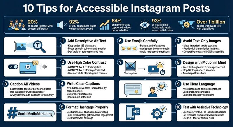
10 Tips for Accessible Instagram Posts
Creating Instagram posts that everyone can enjoy isn't just a nice-to-have - it's essential. With 20% of people interacting with content differently and 92% of U.S. consumers watching videos without sound, accessibility benefits everyone. Here's how you can make your posts more user-friendly:
- Add descriptive alt text: Write clear, concise descriptions for images to help screen reader users.
- Ensure strong color contrast: Use accessible color combinations for readability.
- Caption all videos: Add accurate captions to Reels, Stories, and videos.
- Write clear captions: Avoid decorative fonts and excessive emojis; use proper punctuation.
- Format hashtags properly: Use Camel Case (e.g., #SocialMediaMarketing) for readability.
- Use emojis carefully: Place them at the end of captions and avoid overuse.
- Avoid text-only images: Include key details in captions or alt text.
- Be mindful of motion: Avoid flashing or excessive animation to prevent discomfort.
- Use simple language: Write in clear, precise terms for all readers.
- Test with assistive tools: Use screen readers or get feedback from users with disabilities.
These steps make your content accessible to more people while improving engagement for everyone. Accessibility isn't just about compliance - it's about creating a better experience for all users.
Instagram Alt Text Tutorial: How To Help The Visually Impaired With This Instagram Feature
1. Add Descriptive Alt Text to Every Image
Alt text, or alternative text, is a written description that highlights the key details of an image. It’s essential for users who are blind, partially sighted, or have low vision, as screen readers and text-to-speech tools rely on it to communicate visual content. Without proper alt text, these tools might only announce "image" or provide vague descriptions.
Adding alt text on Instagram is simple. When uploading a photo, go to "Advanced Settings", select "Accessibility", and then tap "Write Alt Text." For posts you’ve already shared, tap the three dots on the post, choose "Edit", and then click "Edit Alt Text."
When crafting your descriptions, focus on what matters most in the image. Highlight the main subjects, include any relevant text visible in the picture, and name well-known individuals if they appear. Keep your descriptions concise - under 125 characters - use complete sentences, and aim to capture the emotion or mood of the image. Skip phrases like "photo of" or "image of", as screen readers already identify the content type.
"It's about giving your blind or partially sighted users as close to the same experience as your sighted followers." – Jonathan Crossfield, Writer [1]
Don’t rely entirely on Instagram’s auto-generated alt text. While Instagram uses object recognition technology to create descriptions, these can often be inaccurate or incomplete.
For better results, try tools like TheBlue.social's Generate Alt Text to get a starting point. Then, fine-tune the AI-generated text to ensure accuracy. Finally, make sure your post design supports accessibility by using high color contrast in your images.
2. Use High Color Contrast and Readable Text
Color contrast refers to the difference in brightness between your text and its background. If the contrast is too subtle, people with low vision or color blindness can have a tough time reading your content. Interestingly, about 93% of individuals who are legally blind still retain some degree of partial vision[1], which makes proper contrast absolutely essential.
To ensure your color choices are accessible, stick to the WCAG 2.1 AA guidelines. These recommend a contrast ratio of 4.5:1 for body text and 3:1 for larger or bold text[2].
For maximum clarity, black text on a white background - or white text on a black background - is one of the most effective combinations, as it offers the highest contrast and works well for nearly everyone[5]. When creating visually rich content like Stories or Reels, consider adding a translucent background behind your text. This prevents the text from blending into busy images, ensuring it stays readable even in visually complex settings[11].
Before hitting publish, use tools like WebAIM's contrast checker to confirm your contrast meets accessibility standards. Avoid placing text directly over intricate images unless you include a solid or semi-transparent background layer. Also, steer clear of decorative or overly stylized fonts, as they can be difficult for users with low vision to read. Prioritizing readability will make your content more inclusive and user-friendly.
3. Caption All Videos, Reels, and Stories
Captions play a crucial role in making your video content accessible to a broader audience. Research shows most viewers watch videos without sound [6], and for individuals who are deaf or hard of hearing, captions are the only way to engage with the spoken content in your videos, Reels, and Stories [2].
But the benefits of captions go beyond accessibility. They also help non-native speakers and anyone watching content in situations where audio isn't practical - like during a commute or in a quiet office.
The numbers speak for themselves: 64% of marketers say their captioned videos perform better than those without captions [1].
Instagram makes adding captions easy with its Captions sticker. After recording or uploading a Reel or Story, tap the sticker icon and choose "Captions" to generate automatic transcriptions [2]. While the AI does the heavy lifting, it’s essential to review and edit the captions for accuracy before posting [5]. For Feed videos, you can enable auto-captioning in the upload settings [1].
"Captions don't only make your videos more accessible to deaf people, many other followers may be more likely to watch if they don't need to turn the audio up." - Sked Social [1]
If automatic captions aren’t enough, you can manually add text using Instagram's Text tool. To ensure readability, position captions away from UI elements and use high-contrast colors, like white text on a dark background [5].
4. Write Clear, Screen-Reader-Friendly Captions
Even if your caption looks polished, using decorative fonts or overloading it with emojis can create challenges for screen readers. Fonts generated by third-party tools are completely unreadable for screen readers - they may either skip over them entirely or interpret them as "an unintelligible string of words" [5][9].
Text-based emoticons can also cause confusion. For instance, the playful "shruggie" ¯\_(ツ)_/¯ is read aloud as "Macron, backslash, underline, katakana, underline, slash, macron", which is far from the lighthearted tone you intended [5]. Instead, opt for standard emojis and place them at the end of your caption to maintain readability and flow.
"It used to be really annoying when people overused emojis. The screen reader would say, 'Smiley face, smiley face, smiley face,' over and over... It's still better to use emojis at the end of a post." - Alex Man, Assistive Technology Officer, Royal Blind Society for Children [1]
To ensure everyone can follow along, write in complete sentences with proper punctuation. This allows screen readers to create natural pauses, making the content easier to understand. If you're using hashtags, capitalize the first letter of each word - like #SocialMediaMarketing instead of #socialmediamarketing - so screen readers can identify and pronounce each word clearly [1][2]. For an even cleaner look, consider moving hashtags to the first comment instead of keeping them in the caption [5][9].
Finally, when including links or a "link in bio" call-to-action, describe exactly what users will find at the destination. Avoid vague phrases like "click here." Clear, precise language not only helps those using assistive technology but enhances the experience for all readers [6].
5. Format Hashtags for Accessibility
Just like clear captions, properly formatted hashtags can make your posts more inclusive. Here's the issue: when hashtags are written in all lowercase - like #socialmediamarketing - screen readers struggle to interpret them correctly. The solution? Capitalize the first letter of each word in your hashtag. This style, known as Camel Case (e.g., #SocialMediaMarketing), makes a big difference.
Camel Case helps screen readers identify word breaks, allowing them to pronounce each word clearly instead of creating a confusing string of sounds. It’s not just about screen readers, though. This approach also makes hashtags easier to read for people with cognitive challenges or dyslexia, as it highlights the structure of the words.
"Capitalizing the first letter of each word of your hashtag makes it a lot easier to read – especially for people using a screen reader. #BeMyEyes is a lot easier to read than #bemyeyes, and it makes each word of the hashtag distinguishable for screen reader software." - Be My Eyes [10]
Placement matters too. To avoid disrupting the flow of your message, place hashtags at the end of your caption or in the first comment. This prevents screen readers from stumbling over repetitive "#" symbols and long lists of tags. It’s worth noting that Instagram posts with hashtags see 29% more engagement than those without [11], so skipping hashtags altogether isn’t a good idea. Instead, focus on using two or three relevant hashtags to keep your posts accessible and user-friendly.
6. Use Emojis and Symbols Carefully
When it comes to creating accessible content, how you use emojis matters. Emojis can add a fun, personal touch to your posts, but if overused or placed haphazardly, they can make things harder for users relying on screen readers. Why? Because screen readers announce the full descriptive name of each emoji. For instance, 😊 is read as "smiling face with smiling eyes", and 🍻 becomes "clinking beer mugs." This can interrupt the flow of your message, making it harder for blind users to follow along.
Take this example: "TGIF!! 😃 🍻🍻🎉 🕺🏽 🍔 🍟 🚖." A screen reader would interpret this as a string of lengthy descriptions, turning a simple Friday celebration post into a confusing jumble of words [1].
To make your content more accessible, try these tips:
- Place emojis at the end of captions to keep the main message clear.
- Add spaces between emojis so assistive technology can distinguish each one properly.
- Avoid skin tone variations unless they're essential to the context, as they add unnecessary detail to the screen reader's output.
- Skip text-based emoticons like ¯\(ツ)/¯, which screen readers interpret as a confusing sequence of punctuation, such as "Macron, backslash, underline, katakana, underline, slash, macron" [5].
Curious about your own emoji habits? Check out TheBlue.social's Emoji Stats tool. It shows your top three most-used emojis on Bluesky, helping you assess whether you're overdoing it with symbols.
Ultimately, use emojis sparingly and thoughtfully. Your message should still make sense even if the emojis were removed. And don’t forget - test all your visual elements with assistive technology to ensure your content is truly inclusive.
7. Avoid Text-Only Images for Key Information
When sharing content, make sure crucial details aren't trapped inside images. Text-only images can be a major roadblock for accessibility because screen readers can't interpret embedded text. Instead, they rely on the alt text you provide to convey information to users who are blind or have low vision [7]. If you skip adding alt text - or if Instagram's AI-generated descriptions miss the mark - that information is essentially lost.
For users with partial vision, text-only images often present additional challenges. They may lack proper color contrast or scalability, making them hard to read. Decorative fonts only make matters worse. As California State University San Marcos points out, "Decorative fonts are unfortunately 100% INACCESSIBLE to screen readers... the screen reader will be silent when 'reading' those words" [5]. This means that popular cursive or stylized fonts, often pulled from online generators, are unreadable for assistive technology, leaving users in the dark.
The fix is straightforward: move any important text from the image to the caption [5]. If an image does include text, provide a full transcription in either the alt text or the caption. Since Instagram has a character limit for alt text, it's often better to include the transcription in the caption [9].
Looking for tools to make your images more accessible? Check out TheBlue.social's Generate Alt Text tool - a free resource that automatically creates descriptive alt text for your images. If you need to extract text from graphics to add to captions, the Extract Text from Images tool uses OCR technology to pull text directly from your images.
8. Design with Motion and Flashing in Mind
When creating Instagram posts, it's essential to consider how motion and flashing elements might affect your audience. Flashing or blinking animations can trigger seizures in individuals with photosensitive epilepsy, while excessive motion might overwhelm users with cognitive sensitivities [2]. The danger is particularly high when flashing occurs between 5 and 30 times per second [2].
To ensure your content is safe, keep flashing to a maximum of 3 times per second [2]. This guideline helps you stay far from the risk zone. If you're designing custom GIFs or animations, set them to stop looping automatically after five seconds to avoid overstimulation [1]. Before uploading, use tools like the Photosensitive Epilepsy Analysis Tool (PEAT) to check for any seizure risks [1]. Managing motion is just as important as using alt text or maintaining proper color contrast when aiming for fully accessible content.
It's also worth noting that many users block animated GIFs or disable auto-play to avoid triggering discomfort [1]. This means your post should still make sense through its captions and static text. Since GIFs often lack accessibility features, be sure to include alt text that provides the necessary context [1][5].
For Stories and Reels, avoid rapid transitions or strobing effects [2]. Use animations and stickers sparingly, ensuring they genuinely enhance your content rather than distract or overwhelm. Thoughtful design, including captions, alt text, and carefully planned animations, makes your posts enjoyable for everyone - regardless of sensory sensitivities. By prioritizing accessibility, you create content that’s engaging and inclusive for all.
9. Use Clear and Precise Language
The way you craft your captions on Instagram can significantly influence how accessible and understandable they are for your audience. Just like thoughtful design enhances visual accessibility, clear language improves readability for everyone.
Writing in straightforward terms helps ensure your message reaches a broad audience, including individuals with cognitive disabilities, non-native English speakers, and those using screen readers. To achieve this, steer clear of jargon, unexplained acronyms, and overly complex sentences that might confuse or exclude readers.
"Clear, simple language can help people with disabilities enjoy your content. When writing descriptions - and comments, and any other text on Instagram - avoid jargon." - Bureau of Internet Accessibility [6]
Another way to make your content more inclusive is by using person-first language. For instance, instead of saying "disabled people", opt for "people with disabilities." This phrasing places emphasis on the individual rather than their condition, fostering a sense of respect and inclusivity [11].
Also, be mindful of your font choices. Decorative fonts or overly intricate characters can create challenges for screen readers, making your content less accessible.
With over 1 billion people worldwide living with disabilities [11] and Instagram boasting 2 billion active users [2], adopting clear and considerate language is more than just a thoughtful gesture - it's a necessary step to engage and respect your entire audience. To make this process easier, tools like TheBlue.social offer a cross-posting scheduler for platforms like Instagram, X (Twitter), Threads, Bluesky, Pinterest, and Mastodon, along with a free alt text generator.
10. Test Posts with Assistive Technology and Real Users
Making sure your content is accessible means going beyond just creating it - you need to test it, too. One of the best ways to do this is by using assistive tools like screen readers. Try navigating your Instagram profile with tools like VoiceOver (iOS) or TalkBack (Android) enabled [4][9]. This lets you experience your posts the way users of assistive technology do.
When you listen to your content through a screen reader, you'll notice things you might not catch visually. For instance, decorative fonts could get skipped or misread, and hashtags like #socialmedia might be jumbled into one incomprehensible word instead of sounding like two distinct ones [9][5]. Emojis can also be problematic if they interrupt your captions instead of appearing at the end, where they belong. Testing in this way helps you spot and fix these kinds of issues.
But don’t stop at technical testing - real user feedback is just as important. Reach out to users with disabilities and ask for their input. Find out if your alt text conveys the emotional tone of your images, if your captions are clear, and if the color contrast in your Stories makes them easy to read [1][11][8]. This step is crucial because 93% of blind individuals still retain some level of partial vision [1]. Their insights can help you fine-tune your content, from the structure of your captions to how you format hashtags.
For more advanced testing, tools like the Photosensitive Epilepsy Analysis Tool (PEAT) can ensure that GIFs and animations don’t trigger seizures [1]. If you encounter accessibility problems, Instagram provides a feedback channel specifically for reporting such issues [4]. And if you're managing content across multiple platforms, consider using TheBlue.social. It allows cross-posting on Instagram, X (Twitter), Threads, Bluesky, Pinterest, and Mastodon. Plus, it offers a free alt text generator to simplify the process of creating accessible content.
Conclusion
Making your Instagram posts more accessible not only broadens your audience but also strengthens genuine connections with all your followers. With over 1 billion people globally living with disabilities, accessibility isn't just a nice-to-have - it's a key part of engaging a diverse audience [11][3]. Plus, many accessibility features are useful for everyone, like commuters watching videos without sound or non-native speakers who benefit from captions.
To recap, here’s a practical framework for creating inclusive content: use concise alt text, maintain strong color contrast, format hashtags properly, and always caption your videos. Keep emojis at the end of captions, avoid decorative fonts that assistive tools can’t interpret, and ensure motion elements are safe for all viewers.
Testing your posts with screen readers like VoiceOver or TalkBack can help catch issues you might overlook visually. Even better, feedback from users with disabilities can offer the most meaningful insights. Social media strategist Alexa Heinrich emphasizes the importance of focusing on details that matter most to screen reader users [1].
For a smoother workflow, consider tools that simplify accessibility practices. Platforms like TheBlue.social support cross-posting to Instagram, X (Twitter), Threads, Pinterest, Bluesky, and Mastodon. They also offer handy tools like a free alt text generator, features for strategic emoji placement, and options for hashtag creation. These resources can help you create content that’s both inclusive and impactful.
FAQs
How do I write effective alt text for Instagram images?
To create effective alt text for Instagram images, focus on delivering a clear, concise description that makes the content accessible for screen reader users. Start by pinpointing the main subject or purpose of the image and summarizing it in roughly 100 characters. Stick to the essential details, like actions, colors, or any relevant context, and skip unnecessary background elements or filler.
When writing alt text, avoid phrases like "image of" and steer clear of adding emojis or hashtags. Instead, describe the visual content directly and in straightforward language. For instance: "A smiling barista pours latte art shaped like a heart." Add context that complements your caption, but don’t repeat it. You can add alt text through Instagram’s Advanced Settings on mobile or in the Accessibility section on desktop.
If you're unsure where to start, tools like TheBlue.social’s free alt text generator can help draft descriptions, which you can then tweak to match your style. Thoughtful alt text not only makes your posts accessible but also keeps your captions clean and engaging.
How can I use color contrast effectively in Instagram posts?
To make your Instagram posts more accessible, focus on using high-contrast text and visuals. Select color combinations that ensure text, icons, or logos stand out clearly against the background. Accessibility guidelines suggest a contrast ratio of at least 4.5:1 for standard text and 3:1 for larger text, making it easier for individuals with low vision or color-vision deficiencies to engage with your content.
Don’t depend solely on color to communicate meaning. Combine color cues with text, symbols, or patterns so your message is clear to everyone, including those who may have difficulty distinguishing certain colors. Opt for bold, straightforward color schemes and use muted or blurred backgrounds when layering text to enhance readability. These strategies ensure your posts are easier to read and more inclusive for a diverse audience.
Why should I add captions to my Instagram videos?
Adding captions to your Instagram videos makes them accessible to deaf and hard-of-hearing users, ensuring everyone can enjoy and interact with your content. Captions are also incredibly helpful in situations where sound isn’t practical - think crowded places or when viewers choose to watch videos on mute.
Incorporating captions doesn’t just support accessibility; it also helps you connect with a broader audience and boosts overall engagement.
Last updated: January 9, 2026