How to Make Pinterest Content Accessible
Pinterest is a visual platform with over 77.4 million monthly U.S. users, but without accessibility, many - including the 61 million Americans with disabilities - are excluded. Accessible content benefits everyone by improving usability and even boosting SEO. Creating accessible Pins is straightforward:
- Add Alt Text: Write clear, descriptive text (up to 500 characters) for screen reader users.
- Use High-Contrast Colors: Ensure text stands out against backgrounds for better readability.
- Minimize Text on Images: Keep visuals clean and reflect key text in the description or alt text.
- Test with Screen Readers: Tools like NVDA or VoiceOver help ensure your content works for all users.
Accessibility isn’t just about compliance - it improves engagement and ensures your content reaches a wider audience. Start small by adding alt text to your next Pin and testing your designs for clarity.
Are you filling in the alt text on your Pinterest Pins? Here's how to do it!
What Is Alt Text for Pinterest
Alt text is a short description of a Pin's image designed for users who rely on screen readers.
On Pinterest, alt text can be added to standard Pins and video Pins, with a generous limit of up to 500 characters [6]. This allows creators to provide detailed descriptions for images, including complex visuals, infographics, or text-heavy Pins that might otherwise be difficult for some users to interpret - far exceeding the usual 125-character recommendation for web images [3].
Focus on describing the image for those who need it.
It's worth noting that alt text is not visible to the general public. Instead, it is exclusively accessed by screen reader technology. Because of this, the focus should remain on describing the image clearly and effectively for accessibility, rather than using the field for promotional content or stuffing it with keywords.
Grasping these alt text guidelines helps ensure your Pins are both accessible and meaningful for all users.
How to Add Alt Text to Your Pins
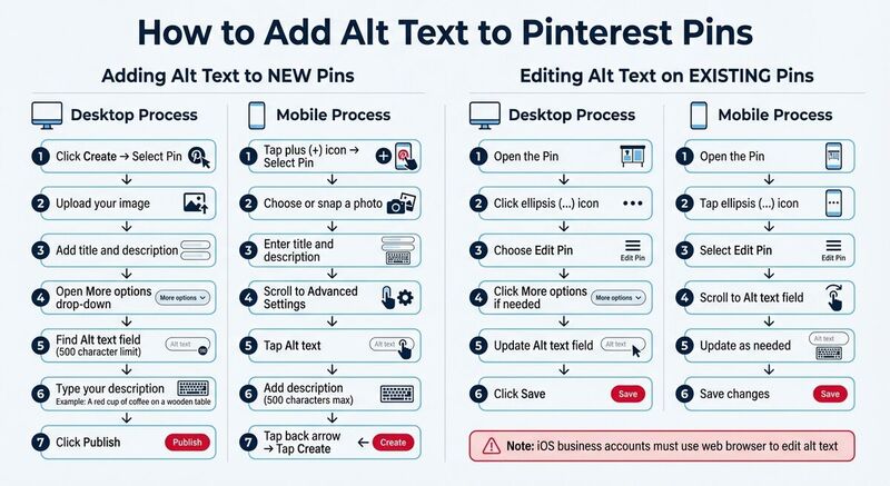 Pinterest provides an easy way to include alt text, whether you're working on new Pins or tweaking existing ones. The steps vary slightly depending on whether you're using a desktop or mobile device. Here's how to do it.
Adding Alt Text to New Pins
On desktop, start by clicking Create and selecting Pin. Upload your image, add the title and description, then open the drop-down menu next to More options. You'll see the Alt text field here, where you can type up to 500 characters. Once you're done, click Publish.
On mobile (iOS or Android), tap the plus (+) icon, select Pin, and either choose or snap a photo. After entering the title and description, scroll to Advanced Settings and tap Alt text. Add your description (up to 500 characters), hit the back arrow, and then tap Create to publish your Pin.
Editing Alt Text on Existing Pins
To edit alt text on a Pin you've already posted, the process is just as simple.
On desktop, open the Pin, click the ellipsis (...) icon, and choose Edit Pin. If you don't see the Alt text field right away, click More options to reveal it. Make your changes, then click Save.
On mobile, open the Pin, tap the ellipsis (...) icon, and select Edit Pin. Scroll to find the Alt text field and update it as needed. Keep in mind, if you’re using a Pinterest business account on iOS, you’ll need to log in on the web to make these edits.
How to Write Better Alt Text
Alt text plays a dual role: it helps users relying on screen readers understand your images and boosts your content's visibility in search results. Striking the right balance between detail and brevity is key. Here are some practical tips to keep your alt text clear, concise, and effective.
Write Clear and Brief Descriptions
While Pinterest allows up to 500 characters for alt text, many screen readers stop after about 125 characters [3]. This means you should prioritize the most important information at the beginning of your description. Focus on the main subject, key colors, and essential details that add value.
Skip phrases like "image of" or "picture of" - screen readers already identify the element as an image. Instead, get straight to the point. For example, instead of saying, "Image of chocolate chip cookies on a plate", go with something like, "Chocolate chip cookies on a rustic wooden plate dusted with powdered sugar." This approach keeps your description specific but avoids unnecessary fluff.
End your alt text with a period to signal a pause for screen readers, and avoid using all caps, as screen readers might interpret capitalized words as acronyms.
Include Relevant Keywords Naturally
Alt text isn’t just for accessibility - it also helps search engines understand your content. Incorporate relevant keywords, but do so naturally. For instance, if you’re sharing a recipe, your alt text might read: "Gluten-free banana bread with walnuts, sliced on a white cutting board." This description is both helpful and keyword-rich without feeling forced.
Avoid stuffing your alt text with repetitive keywords. Not only does this create a poor experience for screen reader users, but it can also harm your content’s overall effectiveness. Instead, focus on making your description useful and contextually appropriate. Whether your image highlights bird species or showcases winter wildlife behavior, tailor the details to what’s most relevant.
Test Your Alt Text with Screen Readers
The best way to ensure your alt text works? Listen to it. Use screen readers like NVDA or VoiceOver to test your descriptions. This process can reveal awkward phrasing or excessive length, offering valuable insight into how approximately 61 million Americans with disabilities might experience your content [2].
Keep in mind that alt text and Pin descriptions serve different purposes. While Pin descriptions are visible to all users and can include hashtags, marketing language, and calls to action, alt text is specifically for screen readers. Craft each one with its unique audience and purpose in mind.
Design Tips for Accessible Pinterest Images
Good design isn’t just about making things look nice - it’s about ensuring everyone can interact with your content. With around 77.4 million monthly Pinterest users in the U.S. [1], many of whom may have visual impairments, accessible design helps make your Pins more inclusive. Building on the alt text practices discussed earlier, here are some practical design tips to improve accessibility on Pinterest.
Use High Contrast and Readable Fonts
Contrast is critical for readability. Make sure text overlays stand out clearly against their background. For example, use bold, larger fonts and position text in easily noticeable areas, such as at the top or center of your Pin.
"When using text, utilize larger, bolder type fonts. Aim for the top or the middle of your pin so that it's easier to locate." - Bureau of Internet Accessibility [1]
Avoid overly harsh or extreme color combinations. Instead, opt for a balanced color palette that separates elements distinctly. For icons, use scalable vector graphics (SVGs) to ensure they remain crisp and clear, even when zoomed in [1].
Use High-Quality, In-Focus Images
Sharp, clear images are a must. Blurry or pixelated visuals can be challenging for users who depend on zoom features to discern details. High-quality images help ensure everyone can engage with your content effectively [1].
Keep Text on Images Minimal
Too much text on an image can create clutter, making it harder for screen readers to process and reducing readability for people with low vision or color blindness [1].
"The very nature of Pinterest makes it difficult to use [for the visually impaired]... its information-heavy design makes it more likely to be tedious using screen readers." - American Federation for the Blind [1]
If your image does include text, reflect it in the alt text field. Place crucial text on solid, high-contrast backgrounds, and use the Pin description for extra details like hashtags, calls to action, or marketing copy [4][7]. This keeps your visuals clean while ensuring screen reader users receive all the necessary information.
Tools for Creating Accessible Pinterest Content
Making your Pinterest content accessible doesn't have to be complicated. With the right tools, you can streamline the process and ensure your Pins are inclusive. Here are three free tools from TheBlue.social that can help.
Generate Alt Text with TheBlue.social
Crafting alt text for every single Pin can be daunting, especially if you're working with a large batch of images. TheBlue.social's free alt text generator simplifies this task by using AI to create descriptions for your images. Just upload your Pin, and the tool provides an editable alt text suggestion that stays within Pinterest's 500-character limit [6].
Extract Text from Images with TheBlue.social OCR
If your Pins feature text overlays - like quotes, recipes, or infographics - screen readers won’t be able to process that embedded text [8]. To make this information accessible, you can use TheBlue.social's OCR tool. This tool automatically extracts text from your images, saving you the hassle of manual transcription. It works with various file types, including screenshots and photos, and supports multiple languages [9][11].
Keep in mind, though, that OCR tools aren’t perfect. Formatting might not always transfer correctly, and occasional errors can occur [10]. For the best results, use sharp, well-lit images without obstructed or distorted text [10]. Always double-check the output to ensure accuracy before adding it to your alt text.
Preview Content with TheBlue.social OG Preview Tool
Before posting, it's a good idea to preview how your Pins will look across platforms. TheBlue.social's OG Preview Tool lets you do just that. It ensures your visuals meet Pinterest's 2:3 aspect ratio and high-resolution standards, while also checking your Open Graph metadata [1]. This metadata helps search engines and social platforms understand and rank your content [12].
By previewing titles, descriptions, and images, you can confirm they’re accessible to assistive devices, an essential step for creating inclusive content [12][3].
"Search engines like Google use alt text and other metadata to understand the content of images and rank webpages in search results. By providing accurate and detailed image descriptions, webpages can improve their visibility and search engine ranking." - Accessible Social [12]
Conclusion
Making Pinterest content accessible is a win-win for engagement and inclusion. With a significant portion of Americans living with disabilities and over 15% of the global population experiencing some form of disability [5], accessibility isn't just thoughtful - it's essential. Plus, accessible design improves the experience for everyone, whether they're navigating with assistive technology, dealing with noisy environments, or using slow internet connections.
To recap, creating accessible Pins is straightforward. Focus on clear alt text, high-contrast visuals, and minimal text overlays - these simple steps go a long way. Tools like TheBlue.social can help by automating alt text creation and extracting text, freeing up your time to focus on crafting engaging content.
As digital accessibility experts point out, even small tweaks can significantly expand your audience. Prioritizing accessibility isn’t just about compliance - it’s about fostering a welcoming community and boosting your content’s visibility on search engines.
Ready to take action? Start small: add descriptive alt text to your next Pin, check your color contrast, and test your content with a screen reader. Each step you take makes Pinterest more inclusive while enhancing your content’s reach.
FAQs
How does adding alt text to Pinterest images benefit accessibility and visibility?
Adding alt text to your Pinterest images does more than you might think - it improves both accessibility and discoverability. For individuals using screen readers, alt text serves as a descriptive guide, offering a clear explanation of the image and creating a more inclusive experience. On top of that, search engines rely on alt text to better understand your content, which can help boost your Pinterest SEO. By writing thoughtful, descriptive alt text, you not only make your pins more accessible but also increase their chances of being found by a broader audience.
How can I ensure my Pinterest content is accessible?
Making your Pinterest content accessible starts with adding descriptive alt text to your images. This ensures users with visual impairments can fully understand the content you're sharing. You can either use tools that automatically generate alt text or craft clear, concise descriptions yourself - just make sure they accurately describe the image.
Another key step is to design with sufficient color contrast. This helps users with visual challenges easily view your content. Also, avoid embedding text directly into images unless you provide an alternative text description.
Finally, don't skip testing your content for accessibility. Tools that check for alt text and color contrast can highlight areas needing attention. By focusing on accessibility, you're making your Pinterest content more inclusive and welcoming to all users.
Why is using high-contrast colors important for Pinterest images?
Using high-contrast colors in Pinterest images plays a key role in making your content easier to see and understand, especially for people with visual impairments or color blindness. When there's a strong contrast between your text and the background, it ensures that important details - like overlays or key visuals - are easy to read and grab attention.
This approach not only reduces eye strain but also makes your designs more inclusive. By prioritizing color contrast, you're improving the accessibility and visibility of your content, allowing it to connect with a broader audience and leave a stronger impact.
Last updated: January 31, 2026